- TIPS & TRICKS/
- DAX for Beginners: The 5 Measures Every Power BI Report Needs/
- TIPS & TRICKS/
- DAX for Beginners: The 5 Measures Every Power BI Report Needs/
DAX for Beginners: The 5 Measures Every Power BI Report Needs
Most people's first DAX formula is copied from a forum, dropped into a measure, and never fully understood. It works, so it stays, and the next measure gets copied the same way. That's fine for a one-off report. It falls apart the moment someone asks why two numbers on the same dashboard don't agree.
You don't need to learn all of DAX to be dangerous in Power BI. Five measures cover the vast majority of real reports - total, ratio, running total, comparison to a prior period, and a filtered version of a total. Learn the pattern behind each one and you can adapt it to almost any business question.
What you'll need before you start
- Power BI Desktop, free to download, with a model that has at least one fact table (sales, tickets, transactions) linked to a date table.
- A basic grasp of what a measure is: a calculation that responds to whatever's on the report, unlike a calculated column, which is fixed per row.
- About 20 minutes.
Why measures, not columns: a calculated column stores one value per row and takes up memory for every row in the table. A measure calculates on demand, based on whatever filters are active, whichever visual it lands in. For anything that needs to change with a slicer or a filter, a measure is the right tool.
Measure 1 - the total
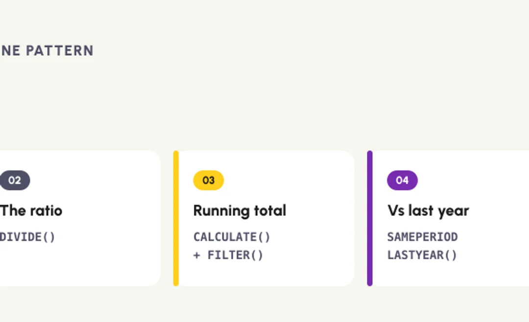
Total Sales = SUM(Sales[SalesAmount])Every report starts here: a plain aggregation of a column. Simple, but it's the building block every other measure in this list refers back to. Give it a clear name now, because you'll reuse it inside more complex formulas later rather than retyping SUM(Sales[SalesAmount]) each time.
Measure 2 - the ratio
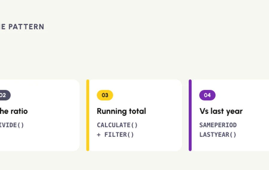
Profit Margin % = DIVIDE([Total Profit], [Total Sales], 0)In practice, this means any "X as a percentage of Y" question: margin, conversion rate, percentage of target. DIVIDE is the safer choice over a plain / because it handles a zero or blank denominator gracefully, returning the third argument (here, 0) instead of an error that breaks your visual.
Measure 3 - the running total
Running Total Sales =
CALCULATE(
    [Total Sales],
    FILTER(
        ALLSELECTED('Date'[Date]),
        'Date'[Date] <= MAX('Date'[Date])
    )
)This is where DAX starts to feel different from Excel. CALCULATE changes the filter context of [Total Sales], and the FILTER inside it says "include every date up to and including the current row's date." The result: a cumulative total that builds as the report moves across days, months or years. At work it looks like a year-to-date sales line, or a project's cumulative spend against budget.
Measure 4 - the comparison to a prior period
Sales Same Period Last Year = CALCULATE([Total Sales], SAMEPERIODLASTYEAR('Date'[Date]))SAMEPERIODLASTYEAR is one of DAX's time-intelligence functions, built specifically for this comparison. Pair it with [Total Sales] and you get last year's figure recalculated for whatever period is currently on the report, so a year-on-year comparison visual updates correctly whether someone's looking at a month, a quarter or a full year.
Measure 5 - the filtered version of a total
Sales - London Only = CALCULATE([Total Sales], Sales[Region] = "London")Why employers care: this pattern lets you show one specific slice alongside the overall total in the same visual, without building a second report or asking someone to filter it themselves. Swap the condition for any field: a product line, a customer tier, a sales channel. Once you understand that CALCULATE overrides the current filter context with whatever you put inside it, this measure and Measure 3 are really the same technique aimed at different problems.
Common gotchas (and the fixes)
- A measure returns a number that looks wrong. Check what's providing filter context, meaning which slicers, rows or columns are active on the visual. A measure recalculates for every combination of filters on the report, so the same formula can validly return different numbers in different visuals.
- `CALCULATE` feels like magic. It is, until you learn the rule: it takes your measure and re-evaluates it inside a new filter context built from whatever conditions you list. Read it as "recalculate this, but first change these filters."
- Row context and filter context get confused. A calculated column works row by row (row context). A measure in a visual works across whatever's currently filtered (filter context).
CALCULATEis the bridge between the two, which is why it appears in almost every non-trivial measure. - Time intelligence functions return blank. They need a proper date table marked as such in Power BI (Model view, then mark as date table), with one row per day and no gaps. Skip this step and
SAMEPERIODLASTYEARand similar functions won't work reliably.
The pattern behind all five
Total, ratio, running total, prior-period comparison, filtered total: different questions, the same underlying tool. SUM or DIVIDE for the raw arithmetic, CALCULATE when you need to change what's being filtered. Once that clicks, writing a sixth or a twentieth measure is a much smaller step than writing the first five.
If your team is building reports on borrowed formulas nobody quite understands, our DAX Introduction course covers exactly this: calculated columns, measures, filter context and time intelligence, on real business scenarios over two hands-on days. Newer to Power BI altogether? Power BI Introduction builds the reporting foundation DAX sits on top of.
Different questions, the same underlying tool. Once that clicks, writing a twentieth measure is a much smaller step than writing the first five.
Next available dates
DAX Introduction
Live, instructor-led training with a real trainer. Book a seat on a scheduled date below, or get a quote for your team to run it privately.
26 Oct 2026
Monday · Virtual · 2 day
£825per person + VAT
26 Nov 2026
Thursday · Virtual · 2 day
£825per person + VAT
17 Dec 2026
Thursday · Virtual · 2 day
£825per person + VAT
Other courses related to this article
Ready to train your team?
Tell us what you need and we'll come back to you with a detailed quote.
- Tailored contentBuilt around your team's work and skill levels.
- Flexible schedulingDates and times that suit your team, not ours.
- Your place or onlineDelivered at your office or virtually.
- Better value per headOne trainer, one day, your whole team.
- A dedicated trainerYour team gets all of the trainer's attention.
- Realistic examplesSample data built around the kind of work your team does.
We reply with available dates and a price for your team. No obligation.
Related Articles
 Tips & Tricks
Can you Calculate Variance Using Excel?
In this guide, we explain variance as a measure of how widely data points deviate from the mean and shows why understanding this spread is useful for deeper insight and risk assessment. It walks readers through calculating variance in Excel, distinguishing between the VAR.S function for a sample and VAR.P for an entire population, then demonstrates each with a car-sales case study.
 Tips & Tricks
How to Use Excel Lookup with Multiple Criteria
This blog explains how Excel’s LOOKUP functions—particularly XLOOKUP and VLOOKUP—can retrieve data based on multiple criteria. It walks through a step-by-step example of finding an employee’s sales in a specific region, showing both an XLOOKUP formula and a VLOOKUP alternative that uses a helper column.
 Tips & Tricks
Excel Skills Self-Assessment Questionnaire
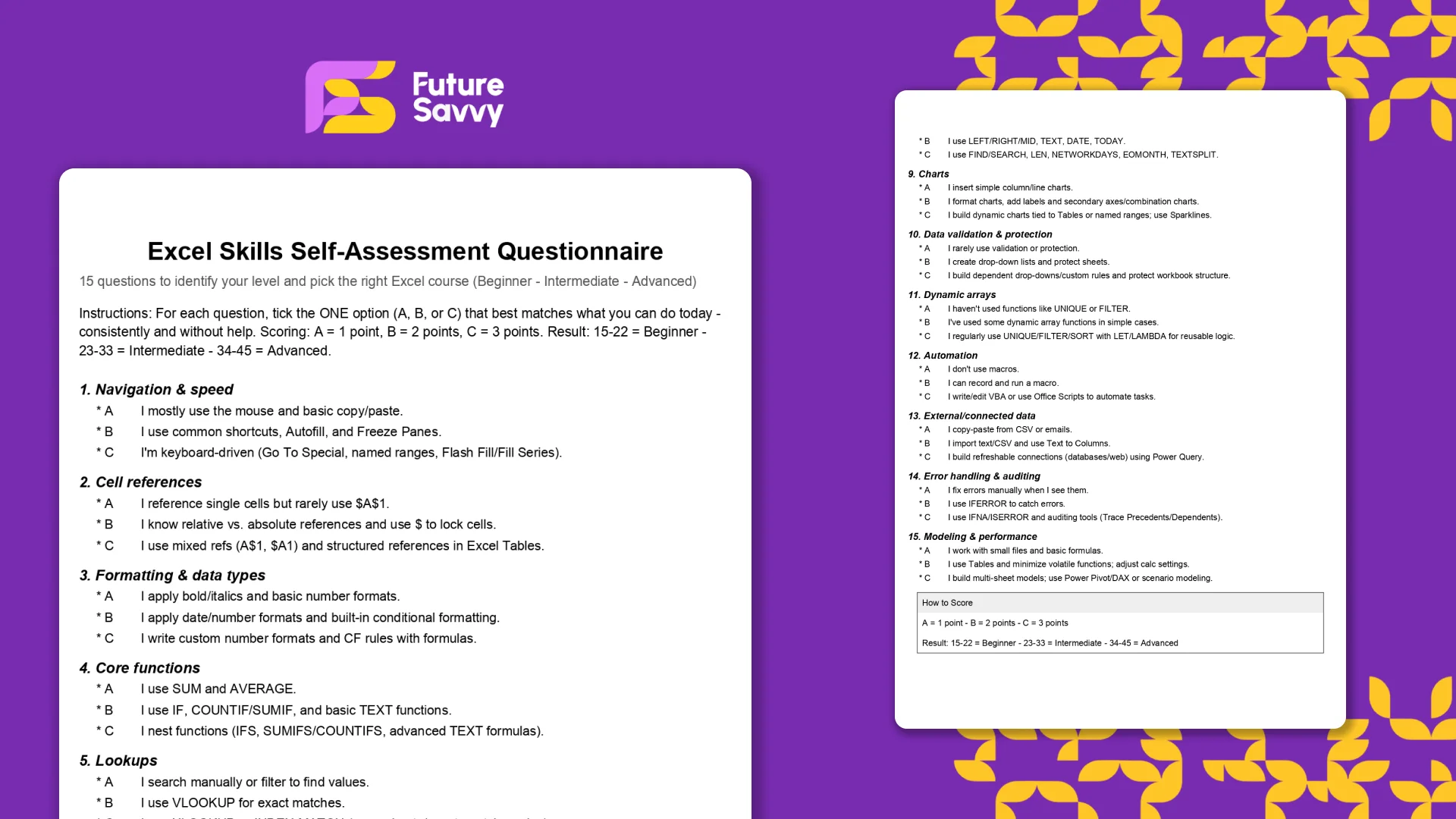
This free, printable Excel Skills Self-Assessment helps you quickly gauge your level and pick the right next step in your learning path. It contains 15 multiple-choice questions spanning navigation, formulas, lookups, tables, PivotTables, charts, dynamic arrays, Power Query, and more. You’ll score yourself and interpret the result to see whether you’re Beginner, Intermediate, or Advanced - then follow tailored course recommendations based on your score.
Insights for modern teams
Stay ahead with our latest learning trends, tools, and success stories. Enter your email address below to receive updates from us.