Resources
Here’s what’s happening in the world of business and IT skills training.
Check out our blog and news page for the latest news from the Future Savvy team!
 L&D Insights
L&D strategy for SMBs: top performers are 5× likelier to train
Top-performing UK SMBs are five times more likely to provide necessary training, and this consistent L&D strategy strongly correlates with higher productivity, profit margins, and employee engagement. By focusing on foundational digital skills (like Excel, PowerPoint, Power BI and SQL), embedding lightweight learning rituals, and equipping managers with simple coaching toolkits, SMBs can unlock significant ROI and reduce costly skills gaps.
 L&D Insights
6–12%: The Productivity Boost: The Real ROI From Reskilling & Upskilling
Reskilling and upskilling offer UK SMBs a fast, low-risk way to boost productivity by 6–12%, often delivering full ROI within a single quarter. By building skills internally rather than relying on expensive external hires, companies can close capability gaps, fully leverage existing tools, standardise best practices, and strengthen employee engagement and retention.
 Tips & Tricks
The 5 Best Online Excel Training Courses
This article highlights the importance of Microsoft Excel in modern business and the gap between daily use and formal training. It introduces the 5 best online Excel training courses—Coursera, Udemy, LinkedIn Learning, Microsoft Office Courses, and Future Savvy—each catering to different needs, budgets, and learning styles. The guide emphasises building foundational skills, mastering formulas, and using structured learning for long-term growth.
 Tips & Tricks
How to Aggregate Data in Excel
The article explains how Excel’s AGGREGATE function lets you calculate sums, counts, and averages while automatically ignoring hidden rows, errors, or missing data—problems that derail standard formulas. A step-by-step example shows how to total orders, count active clients, and find average orders per client even when some rows are hidden or contain errors.
 Tips & Tricks
 Tips & Tricks
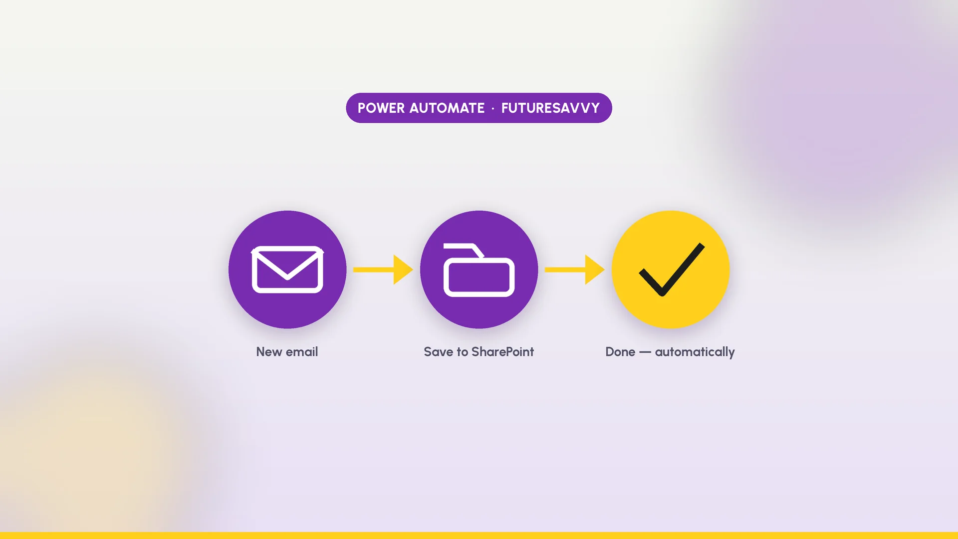
Top AI Skills for 2026
AI is becoming a standard workplace tool, so the real advantage is no longer having “AI” in your job title but knowing how to use AI to work faster, more accurately, and more effectively. The most valuable professionals in 2026 will combine practical AI skills such as prompting, workflow design, verification, and automation with human strengths like judgement, communication, and ethical decision-making. Rather than chasing hype or specific tools, workers at every level should build a stack of durable AI capabilities that improve real business outcomes and make them more adaptable over time.
 Tips & Tricks
How to Use AI as a Tutor: Prompts and Habits That Actually Improve Learning
This article explains how students can use AI as a tutor to deepen understanding rather than simply copy answers. It shows practical ways to use AI for step-by-step explanations, checking work, personalised practice, and short study sprints while keeping critical thinking at the centre. It also stresses the importance of verification, honesty, teacher guidance, and healthy study habits so AI supports learning instead of replacing it.
 L&D Insights
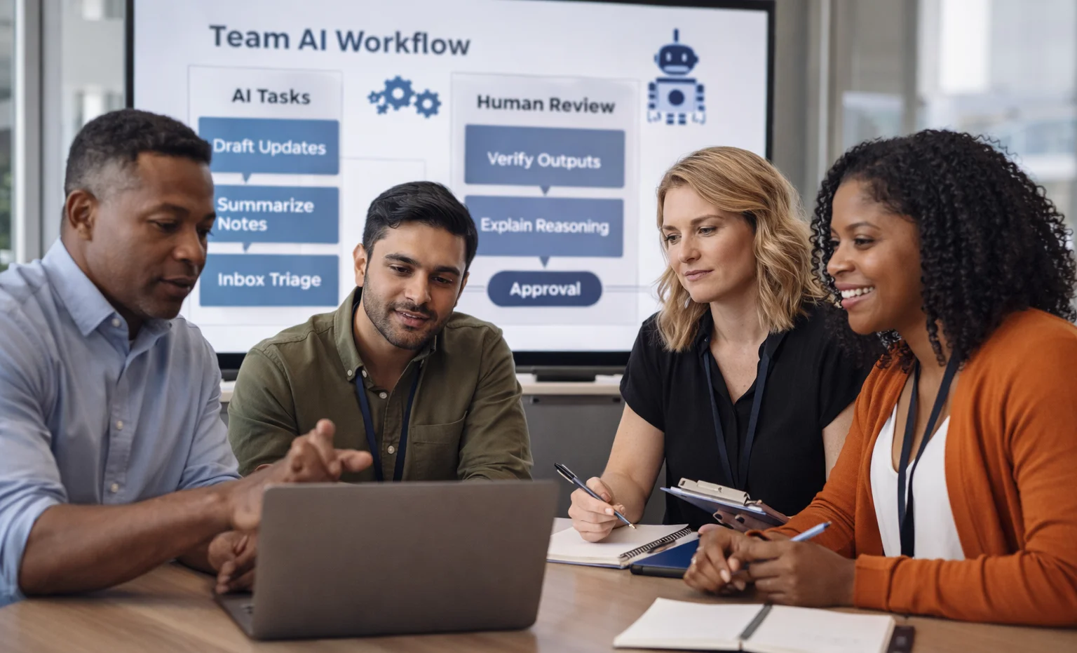
AI for Managers: A Guide
AI is moving into everyday management work, and the biggest constraint is no longer access to tools - it’s the lack of clear use cases, norms, and guardrails. The article shows managers how to translate executive AI ambition into practical team workflows with defined decision rights, human-in-the-loop checks, and a paced rollout. It also explains how to protect learning, update coaching and performance practices, and build a transparent culture where AI reduces busywork without eroding trust.
 Tips & Tricks
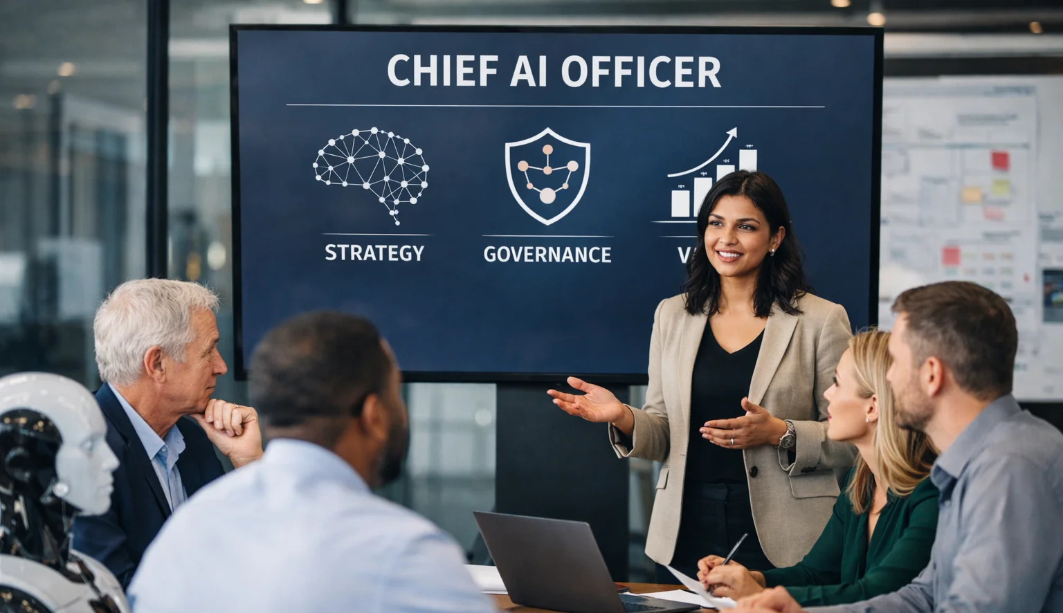
Do You Need a Chief AI Officer? A Practical Guide to the Role and Its Value
A Chief AI Officer (CAIO) exists to turn scattered experiments into safe, measurable enterprise value by owning the AI portfolio, operating model, governance, and adoption. You need a CAIO (or an explicitly expanded mandate) when AI is strategically material across multiple functions, risk/regulatory exposure is rising, and CIO/CTO/CDO bandwidth can’t realistically cover both delivery and vigilance.