- TIPS & TRICKS/
- Build Your First Power BI Dashboard: A Step-by-Step Walkthrough/
- TIPS & TRICKS/
- Build Your First Power BI Dashboard: A Step-by-Step Walkthrough/
Build Your First Power BI Dashboard: A Step-by-Step Walkthrough
This walkthrough builds a working Power BI dashboard from a single Excel workbook, entirely in the browser. No Power BI Desktop install, no IT ticket: if you can sign in at app.powerbi.com with your work or school account, you can follow every step on screen.
Every screenshot below is from the real build. The example file is an office-supplies sales workbook with 645 orders spanning September 2025 to August 2026; each row has a date, a region, a product, a salesperson, units and revenue. By the end, those 645 rows have become four connected visuals that answer the four questions every sales dashboard exists to answer: how much, where, which way is it heading, and who.
What you'll need before you start
A browser signed in to app.powerbi.com. A free Power BI licence is enough to build everything below in My workspace; you only need a paid licence when you start sharing with colleagues.
A spreadsheet with real data: sales, project hours, support tickets, whatever you already track. It wants one row per record and a header on every column. If yours is formatted as an Excel table, even better; you'll see why in step one.
About 30 minutes.
Time-saver: before you touch Power BI, decide the one question your dashboard must answer. Ours is "how are office-supply sales doing, and who is selling them?". Every visual below earns its place by answering part of that; anything that doesn't would be decoration.
Upload your workbook
In My workspace, choose New item, then Get data, and pick Excel workbook. Power BI offers two ways in: Link to file points at a workbook that lives on OneDrive or SharePoint and picks up changes when the file changes, while Upload file takes a one-off copy from your machine. For a first build either is fine; we uploaded.
Next comes Choose data, listing everything Power BI found inside the workbook. Ours shows two entries: Orders, a formatted Excel table, and Raw, the plain worksheet behind it. Tick the table, not the sheet. A table carries its own column headers and boundaries, so nothing has to be guessed.
Pause on the preview before clicking on. Five of our six columns look right, but Order date is showing whole numbers like 45903 instead of dates. The data isn't broken; the column type is wrong, and that's the next step.
Fix the data types in Power Query
Click Transform data and the table opens in Power Query, Power BI's built-in clean-up room. Nothing you do here touches the original workbook. Each change is recorded as a step in the Applied steps list on the right, and the whole list replays automatically every time the data refreshes.
Every column header carries a type icon: ABC for text, 123 for numbers, a calendar for dates. Order date has the 123 icon, which is exactly why it reads 45903. That's the serial number Excel uses internally for 3 September 2025, the first date in our data. Plot that column on a chart now and you'd get a meaningless number line.
Right-click the Order date column, choose Change type, and pick Date.
The serials turn into real dates on the spot, and Changed column type joins the Applied steps list.
Almost every "my chart looks wrong" problem in a first Power BI build is a type problem underneath. Dates typed as numbers can't sit on a timeline, and numbers typed as text can't be summed. The thirty seconds this step takes is the best-value time in the whole build.
Create the report
Click Create a report (top right of Power Query). Power BI asks where to save and what to call the semantic model: that's the cleaned, stored copy of your data that reports read from. We named ours Office supplies orders and saved it to My workspace.
You land in the report editor. Three panes matter. The canvas on the left is where visuals live. Visualizations in the middle holds the chart-type gallery and, below it, the field wells that feed whichever visual is selected. Data on the right lists the six columns from the Orders table, ready to drag.
The breakdown, a column chart
Click an empty spot on the canvas, then the clustered column chart icon in Visualizations. Drag Region from the Data pane into X-axis, and Revenue into Y-axis.
Power BI sums revenue per region without being asked; that's the "Sum of Revenue" in the title. Of the £581,615 total, London leads on £194,656, Manchester follows on £157,027, then Leeds, Birmingham, and Glasgow bottom on £56,479. Two drags, and the where question is answered.
The trend, a line chart
Click another empty spot, choose the Line chart visual, and drag Order date into X-axis and Revenue into Y-axis.
First surprise: you get a nearly straight line with no story in it. Power BI plots dates through a hierarchy (Year, Quarter, Month, Day) and starts at Year, and this data only spans two years, so the chart is literally two points.
Fix it with the double-arrow icon in the header above the visual, "Expand all down one level in the hierarchy". Click it twice, down to month level, and the real shape appears: revenue bumped along between £30,000 and £41,000 a month through the winter, with November 2025 the low at £30,454, then stepped up hard in April 2026 to £60,782 and has held above £60,000 since, peaking at £67,784 in July. That step change is the kind of thing a totals row never shows you.
The headline number, a card
Click empty canvas, choose the Card visual, and drag Revenue into it. That's the entire job. One big number: £581,615, displayed as 582K.
Cards look almost too simple to bother with, but the big-number-plus-context pattern is how most real dashboards open: the card answers "how much", and the charts around it answer "compared to what".
The interactive bit, a slicer
Add a Slicer visual and drag Salesperson into its Field well. It renders as a checkbox list of the five salespeople in the data.
A slicer is a filter that lives on the page. Nothing happens until a viewer ticks a name, and that's the point: you're handing your audience the controls.
Arrange, save, and switch to Reading view
Drag and resize until the page reads in the order the questions get asked: we put the 582K card top left, the monthly trend beside it, the region breakdown below, and the slicer next to the trend where it's easy to reach.
Save with the disk icon in the top bar, then click Reading view. This is what colleagues will see when you share the report: the same interactive page with the editing panes gone, and Export, Share, Subscribe and Set alert along the top instead.
The payoff: one click, four answers
Still in Reading view, tick Priya Sharma in the slicer. Every visual on the page recalculates at once. The card drops from 582K to 117K (her £117,394 across 135 orders). The trend redraws and shows her April 2026 spike of £18,962. And the region ranking quietly changes: company-wide, Leeds outsells Birmingham, but on Priya's numbers Birmingham (£16,005) overtakes Leeds (£14,811).
That last detail is the whole argument for a dashboard over a spreadsheet. Nobody asked "does Priya's regional mix differ from the company's?", and the answer surfaced anyway, one click deep. Interactivity isn't a gimmick; it's how questions you didn't think to ask get answered.
Common gotchas (and the fixes)
Dates show as numbers like 45903, or sort strangely. A type problem from step 3. Numbers mean the column came in as whole numbers; strange sorting usually means it came in as text, which sorts alphabetically. Either way: Transform data, right-click the column, Change type, Date.
A number looks summed wrong. Click the field's dropdown in the field well and check the aggregation. Power BI defaults to Sum, but sometimes you want Count (how many orders?) or Average (typical order size?). Sum of a Units column and Count of an Orders column are very different claims.
The slicer doesn't filter one of your visuals. Visuals only cross-filter others on the same report page, and individual interactions can be switched off. Select the slicer, then Format, then Edit interactions, and check what each visual is set to receive.
Your line chart is one straight line. The date hierarchy is sitting at Year level, exactly as in step 6. Expand down to months with the double-arrow icon on the visual header.
The dashboard gets cluttered fast. Resist adding a fifth and sixth visual before the first four have proved themselves. Our four (a total, a breakdown, a trend and a slicer) cover how much, where, which way, and who; a visual that repeats one of those answers is taking space from a new one.
You just built a real dashboard
One workbook, four visuals, about thirty minutes: a 645-row spreadsheet is now a page that answers how much (£581,615), where (London, by some distance), which way (a step up in April 2026 that holds), and who (one click on any salesperson). The same recipe works unchanged on your sales table, your ticket queue or your project hours.
If you'd rather build these skills hands-on, on realistic data that mirrors your team's work, with a trainer in the room the moment a chart does something confusing, that's exactly what our instructor-led Power BI courses are for.
See our Power BI training coursesNext available dates
Power BI Introduction
Live, instructor-led training with a real trainer. Book a seat on a scheduled date below, or get a quote for your team to run it privately.
26 Oct 2026
Monday · Virtual · 2 day
£825per person + VAT
16 Nov 2026
Monday · Virtual · 2 day
£825per person + VAT
10 Dec 2026
Thursday · Virtual · 2 day
£825per person + VAT
Other courses related to this article
Ready to train your team?
Tell us what you need and we'll come back to you with a detailed quote.
- Tailored contentBuilt around your team's work and skill levels.
- Flexible schedulingDates and times that suit your team, not ours.
- Your place or onlineDelivered at your office or virtually.
- Better value per headOne trainer, one day, your whole team.
- A dedicated trainerYour team gets all of the trainer's attention.
- Realistic examplesSample data built around the kind of work your team does.
We reply with available dates and a price for your team. No obligation.
Related Articles
 Tips & Tricks
Can you Calculate Variance Using Excel?
In this guide, we explain variance as a measure of how widely data points deviate from the mean and shows why understanding this spread is useful for deeper insight and risk assessment. It walks readers through calculating variance in Excel, distinguishing between the VAR.S function for a sample and VAR.P for an entire population, then demonstrates each with a car-sales case study.
 Tips & Tricks
How to Use Excel Lookup with Multiple Criteria
This blog explains how Excel’s LOOKUP functions—particularly XLOOKUP and VLOOKUP—can retrieve data based on multiple criteria. It walks through a step-by-step example of finding an employee’s sales in a specific region, showing both an XLOOKUP formula and a VLOOKUP alternative that uses a helper column.
 Tips & Tricks
Excel Skills Self-Assessment Questionnaire
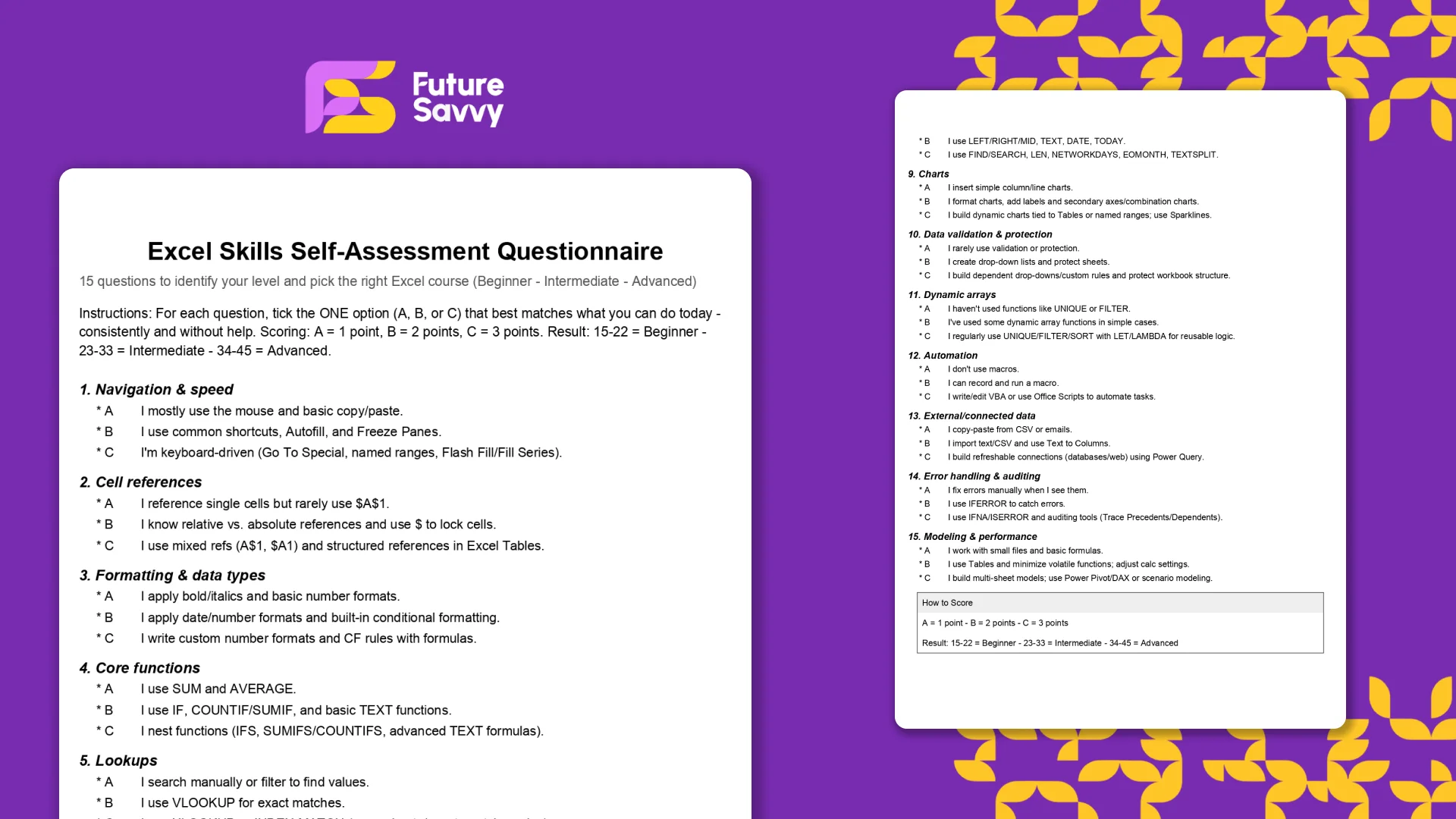
This free, printable Excel Skills Self-Assessment helps you quickly gauge your level and pick the right next step in your learning path. It contains 15 multiple-choice questions spanning navigation, formulas, lookups, tables, PivotTables, charts, dynamic arrays, Power Query, and more. You’ll score yourself and interpret the result to see whether you’re Beginner, Intermediate, or Advanced - then follow tailored course recommendations based on your score.
Insights for modern teams
Stay ahead with our latest learning trends, tools, and success stories. Enter your email address below to receive updates from us.