- TIPS & TRICKS/
- How to Implement Sankey in Excel/

How to Implement Sankey in Excel
- TIPS & TRICKS/
- How to Implement Sankey in Excel/
How to Implement Sankey in Excel
Visualising data is one of the primary reasons many individuals and companies use Excel. While some people prefer a bar graph, a pie chart, or a line graph, a Sankey diagram is often preferred for its ability to highlight bottlenecks, show dominant contributors, and show the change, movement, and flow of your data.
This guide is going to go over how to implement Sankey in Excel and go over some benefits of using Sankey diagrams, how to deal with common challenges, and more.
Future Savvy’s instructor-led Excel training courses are an excellent way to boost your digital skills.
What Is a Sankey Diagram?
A Sankey diagram is a popular data visualisation technique that highlights the flow of data through the different stages in a system or process. It’s made up of nodes, which are the different categories or steps within the diagram, as well as links or flows, which are the connections between nodes that show the path of the data.
Generally, the width of the links or flows coincides with the amount or size of data flowing through them. Wider links represent higher amounts of data moving, while thinner links represent less data being transferred.
Benefits of Using Sankey Diagrams in Excel
Using a Sankey diagram offers several benefits for companies. It can help to identify bottlenecks, find inefficient parts of a process, properly allocate resources, highlight relationships, and show which contributors are the largest or most important in a system.
There are many different business applications for Sankey diagrams, ranging from analysing financials, managing operations, tracking customer journeys, optimising workflows, mapping out the life cycles of inventory, and many others.
How to Create a Sankey Diagram in Excel
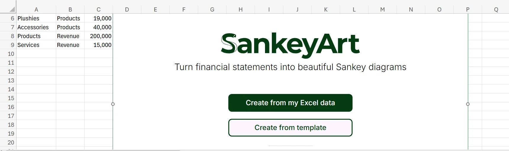
There’s unfortunately no native support for Sankey diagrams in Excel. As a result, you’ll need to use an add-in to unlock the feature. Thankfully, there are a few of them you can choose from. This example is going to show how to use one of these popular add-ins (SankeyArt) to easily and quickly create a Sankey diagram in Excel.
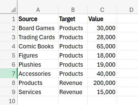
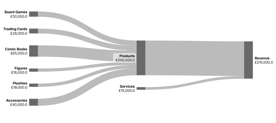
1. The first step is to open your dataset and prepare it properly. To work in a Sankey diagram, your data needs to be designed in a certain way. You need at least three columns, the first two are the “Source” and “Target” columns, with the remaining being the value or amount. You can add as many as you need, but at least three columns in total.
The Source column is the beginning of that line/flow, while the Target is where it ends, and the value columns simply highlight the amount of data being transferred between the source and the target in that line.
In this example, we’re going to highlight a hobby/comic book store that wants to see a visualisation of their annual revenue and where it comes from.
2. Once your data is prepared, head to the Add-Ins button on the Home tab of Excel. Choose the Sankey add-in you want to use, and add it.
3. The add-in should open, and you simply need to follow the steps to get started. For SankeyArt, this means signing up for a free account.
4. Once you’re in your account and signed in, click Create from my Excel data.
5. Next, follow what the instructions say, which in this case is to drag your mouse over the range of cells in your dataset.
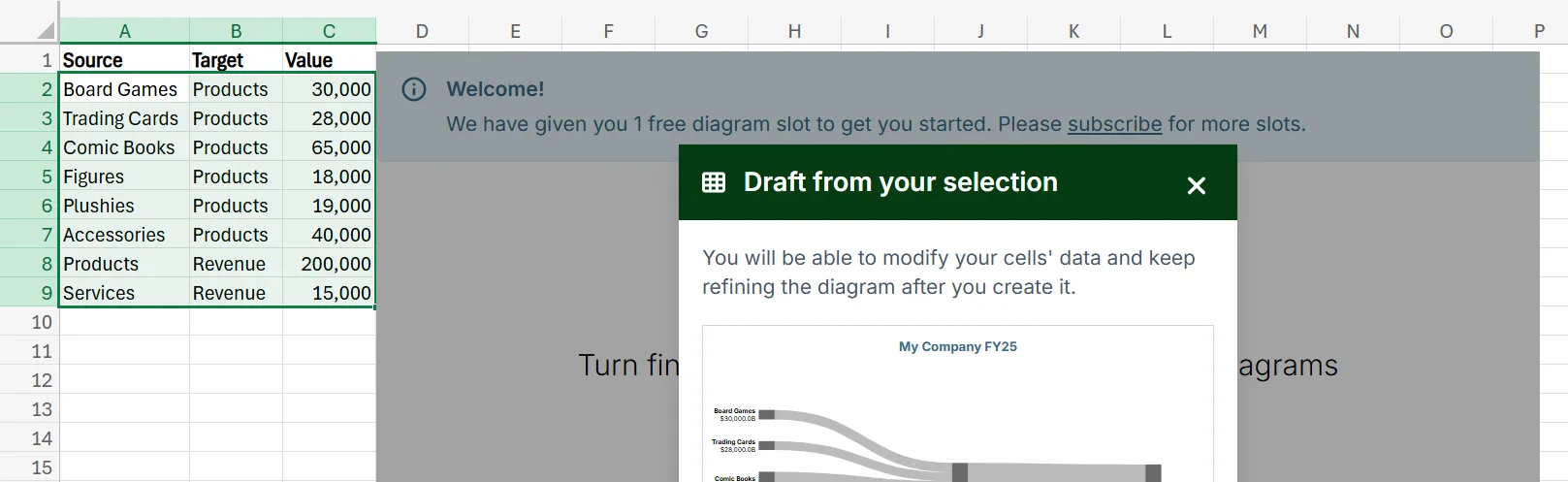
6. After confirming your range, the add-in will instantly create a Sankey diagram for you.
7. If you want to fine-tune the diagram, you can adjust the size, layout, labels, and titles to ensure it looks the way you want.
8. Once you’re happy with it, you can share, download, or create a copy of the diagram to send out to your team, manager, investors, or anyone else who may need to see it.
Troubleshooting Common Challenges
While using an add-in to create a Sankey diagram in Excel is straightforward and simple, some challenges may arise. Here are a few you might run into, and how you can deal with them.
Too Much Visual Clutter
If you have too many nodes or lines/flows in your Sankey diagram can lead to lots of overlapping and visual clutter. This clutter can lead to data overload, and be overwhelming for anyone viewing it.
To deal with this issue, consider adjusting the size of the different components of the diagram to make it less cluttered, and think about consolidating the number of nodes or flows in the diagram to keep it as clear as possible.
The Diagram is Hard to Follow
In some cases, a Sankey diagram can be quite tough to follow. This is not only due to the aforementioned clutter, but also if everything is the same colour, if lines or nodes aren’t labelled, and if the diagram doesn’t have a title that highlights what it’s showing.
Also, even well-made Sankey diagrams can be challenging for someone to follow if they’ve got no experience working with them.
To keep your Sankey diagrams as easy to follow make sure to include clear labels, consider using different flow colours to separate the data, and consider adding some instructions or guidance for how to interpret or understand the diagram.
Incorrect or Inaccurate Flows
If some of the flows in your Sankey diagram aren’t right or are labelled incorrectly, it can ruin its accuracy. To fix this issue, always look closely through your dataset to check for any errors. This may be an incorrect number, data being in the wrong format, or even a value being missing. Even a single tiny error, like an extra comma in a number or a missing digit, can lead to the entire diagram being skewed or inaccurate.
Get in touch today to discuss how you and your team can expand your business!
Related Articles
 Tips & Tricks
Design a Cashflow Forecast Template in Excel
A cash-flow forecast template in Excel lets businesses track incoming and outgoing cash, spot shortfalls early, and plan investments confidently. The guide walks you through structuring rows for receipts and payments, columns for time periods, and using SUM-based formulas to automate totals and month-end balances.
 Tips & Tricks
How to Create a Histogram in Excel
This article provides a step-by-step guide on how to create a histogram in Excel to visualise numerical data distributions. It walks readers through importing data, inserting a histogram, customising the chart, adjusting bin widths, and adding data labels. The guide uses employee age data as an example and highlights how histograms can help identify patterns and outliers.
 Tips & Tricks
How to Create a Spider Chart in Excel
Spider (radar) charts plot several variables on axes radiating from a central point and connect them into a polygon, making complex multivariate data easy to see at a glance. They help compare strengths, weaknesses, patterns and outliers. In Excel you simply lay out the data, choose Insert → Radar, then tweak titles, labels, colours and axes to suit.