- TIPS & TRICKS/
- How to Create a Spider Chart in Excel/


How to Create a Spider Chart in Excel
- TIPS & TRICKS/
- How to Create a Spider Chart in Excel/
How to Create a Spider Chart in Excel
To visualise and compare data in Excel, there are several different charts and graphs you can use. However, many options are fairly basic and may struggle to work as well for complicated or multivariate data as they do for simple or basic data.
If you want to visualise multivariate data and easily compare the values of each variable across different categories, a spider chart may be just what you need.
This guide has a look at what spider charts are, what they can be used for, how to create one in a few simple steps, and more.
Explore our comprehensive suite of Excel courses, designed to support learners at both foundational and advanced levels.
What Is a Spider Chart in Excel?
A spider chart, which is also called a radar chart, helps you display complex multivariate data in a neat and tidy two-dimensional chart. It shows three or more variables that all start from the same point, which is generally the middle of the chart, and then extend outward, with the distance depending on the value of each variable.
Each variable also has its own axis, and the data points on each axis get connected via a line, which creates a polygon.
It’s called a spider chart as the shape of it resembles a spider web with each data point extending out from a central starting point, and then being connected together with lines.
Key Benefits and Use Cases of Spider Charts
There are many benefits of using a spider chart. It helps you visualise the strengths and weaknesses within a group, spot patterns and outliers, and makes comparing variables easy. It also helps you present a large collection of complex data in one streamlined chart.
These charts are also visually appealing and engaging, and are versatile enough to be used for a variety of purposes in many different fields and industries.
As far as use cases, businesses can use these charts in a variety of different ways. This includes:
- Evaluating employee performance
- Tracking project performance
- Analysing different investment portfolios
- Comparing product features and sales
- Comparing performance to industry or company benchmarks
- Visualising patterns
How to Create a Spider Chart in Excel
Now that you’re aware of what these charts are, why they’re used, and the benefits they provide, let’s look at how to create a spider chart in Excel.
For this example, this spider chart is being made by a company looking to compare the performance of different employees against one another, to identify areas where certain employees are strong, and where they may need some work.
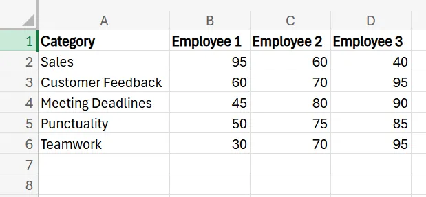
1. Set up your dataset. It’ll include the employees, as well as their performance value in each category. A 100 is the best possible performance in the category, while a 0 represents the worst possible performance.
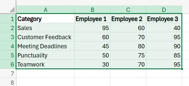
2. Select the entire dataset.
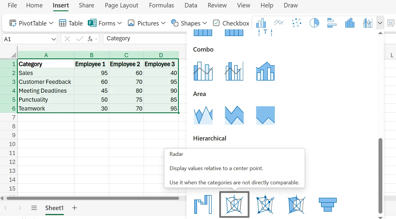
3. Navigate to Insert in the Excel ribbon, and then find and select the Radar chart option.
4. After clicking Radar, a radar/spider chart is automatically generated.
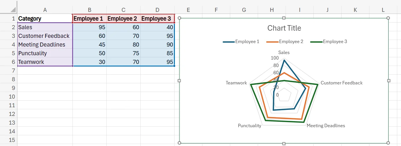
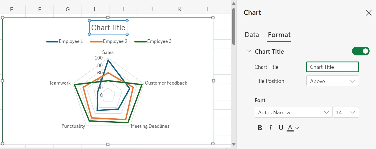
5. To change the title, simply double-click the title, and it’ll open a menu that lets you adjust the title to whatever you’d like. You can also adjust the placement, size, and font for the title, as well.
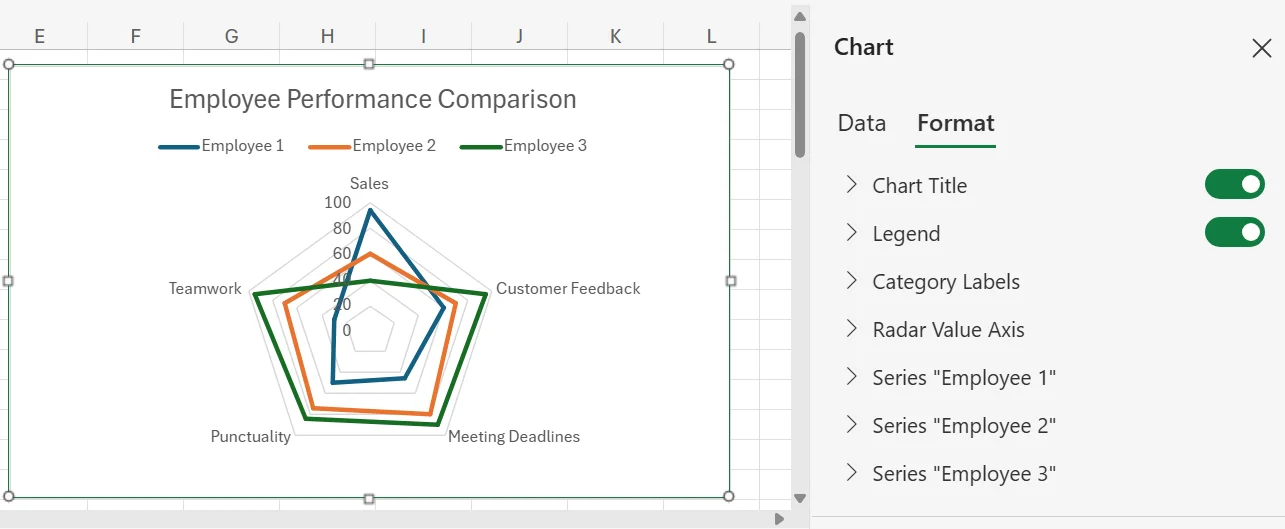
6. There are several other ways to customise the chart, as you can change the colours, adjust the employee names, change the category labels, alter the axis, and more. To make these changes to the chart, simply double-click any area on the chart and choose the part of the chart you want to adjust from the pop-up menu that appears.
Common Issues and Troubleshooting Tips
While creating a spider chart in Excel is straightforward, there are some issues you may run into. Here are a few of the most common problems and how you can deal with them properly.
The Chart Looks Too Cluttered
A common problem with spider charts is that if they have too much data or too many variables, they can look very cluttered and cramped. They can become very hard to read and understand if you’re trying to add too much information, so they’re often better for smaller or lighter datasets.
If you have a dataset that’s too large, but still want to use spider charts, consider breaking up the data into smaller and more manageable sections and using multiple spider charts for the data instead of one.
Difficult to Interpret for Some People
While those who know about spider charts can understand what they’re showing relatively easily, those who haven’t seen one before may be confused by what they’re actually illustrating. The structure is a little more abstract than other types of charts, like a bar chart or a pie chart, so an unfamiliar audience may need to put in more time and effort to understand it.
A way to deal with this issue is to ensure you have the proper labels for all the data in the chart, and a legend that helps people understand more easily. Also, a quick explanation of the chart and what each data point, number, and category means can also go a long way in helping people be able to read and understand the chart with less effort.
The Lines May be Confusing
While spider charts use lines to help form the polygon that represents a data profile, these lines can also be confusing. Many viewers may assume that a line leading from one data point to another means that there’s a relationship between the two points, which isn’t true. Connecting the lines is only for aesthetic purposes and to show the data profile, and doesn’t mean the connected points are somehow related.
To fix this issue, simply make sure to tell the person or group you’re sharing the chart with that the lines between data points are meaningless and don’t signify any sort of relationship between the different variables being linked.
Future Savvy delivers instructor-led training programs that drive measurable business growth - contact us to learn how we can support your team.
Related Articles
 Tips & Tricks
How to Create a Histogram in Excel
This article provides a step-by-step guide on how to create a histogram in Excel to visualise numerical data distributions. It walks readers through importing data, inserting a histogram, customising the chart, adjusting bin widths, and adding data labels. The guide uses employee age data as an example and highlights how histograms can help identify patterns and outliers.
 Tips & Tricks
How to Create a Stacked Bar Chart in Excel
A stacked bar chart lets you see both totals and the category-level breakdown within each bar, making comparisons richer than a standard bar chart. The article walks you through creating one in Excel: organise data by categories, select the range, choose Insert › Stacked Column, and fine-tune titles, legends, colours, and data labels. Best practices include limiting each bar to roughly four stacks, adding concise labels, and using clearly distinguishable colours to keep the visualisation readable. W