- TIPS & TRICKS/
- How to Create a Histogram in Excel/


How to Create a Histogram in Excel
- TIPS & TRICKS/
- How to Create a Histogram in Excel/
How to Create a Histogram in Excel
A histogram is a graph that visualises the distribution of numerical data. It shows the data in the form of bars, with each bar representing a specific range of data points. They’re great for showing off a large or complex dataset in a way that’s much easier to interpret.
They’re especially important for visualising data in Excel, as they can help you identify outliers in a dataset, notice patterns, and even display data in a way that’s easily understood by a wider audience. Thankfully, the process for making them in Excel is fairly simple.
Read on to learn how to make a histogram in Excel, and some of the many ways your business can use them.
Explore our Excel courses for detailed guides and tips on a variety of other topics!
How Do I Make a Histogram in Excel?
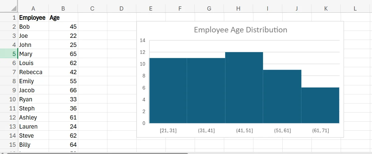
There are only a few quick and easy steps involved in making a histogram in Excel. For this guide, we’re going to use an example of a company that’s using a histogram to visualise the age distribution of its employees.
1. Create or import your dataset of employee names and ages.
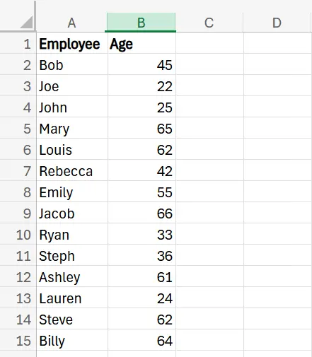
2. Select the entire range of employee ages in your dataset, navigate to the Insert menu, and click Histogram.
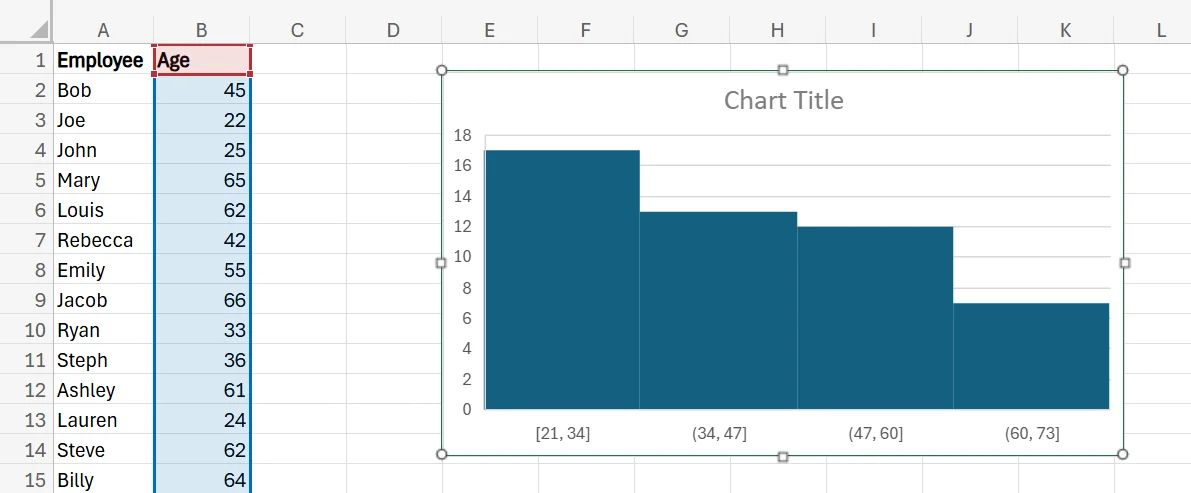
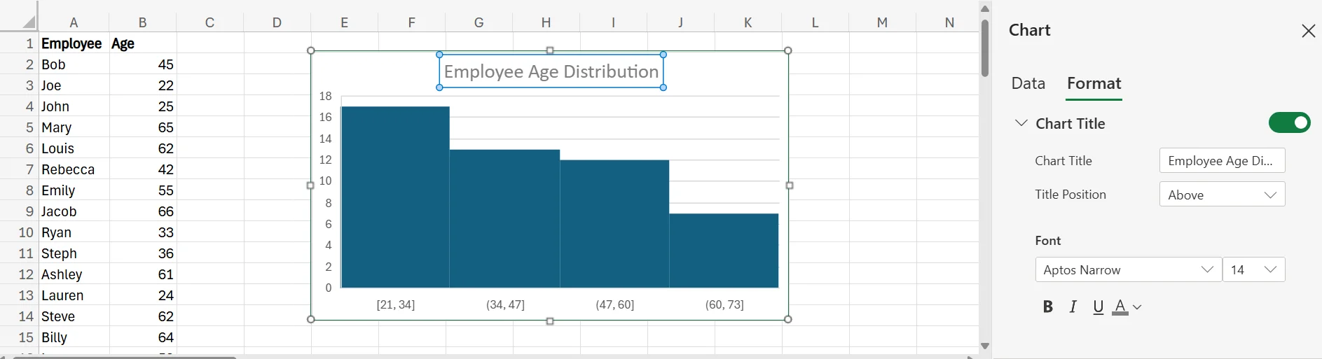
3. Once the histogram is created, there are numerous ways you can edit and fine-tune it to ensure it fits your needs. For example, you can resize it by clicking and dragging any of the corners, change the colours by clicking any of the bars, and rename it by double-clicking the title and changing the chart title in the window that pops up.
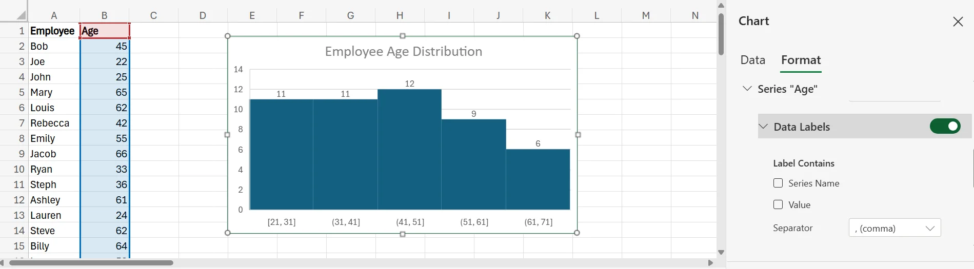
4. If you’re not happy with the ranges that Excel created for the data, you can adjust these as well. Simply right-click the histogram, click Format, and choose the bottom option, which in this example is Series “Age”.
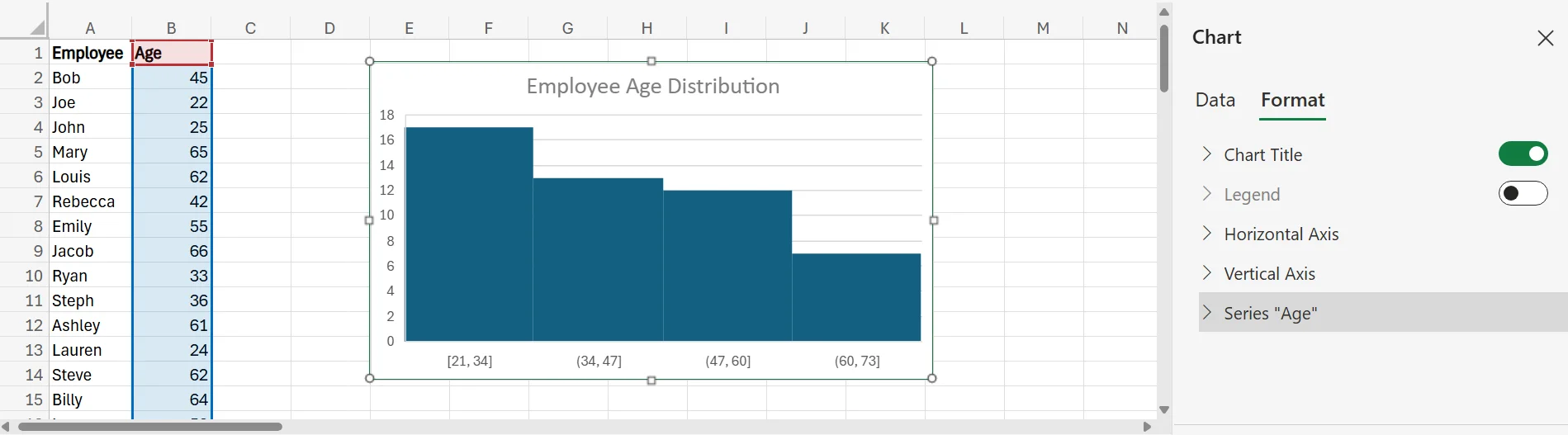
5. In that section, choose “Bin width” from the dropdown menu next to “Bins”, and adjust the bin width to whatever you want the range for each bar to be. For this example, we’ll go with 10. When you do that, the chart will automatically adjust itself, as you can see below.
6. You can also add data labels to the histogram, so you can easily and quickly see the value in each bar without having to compare it to the numbers on the y-axis. To do this, simply go to the same place where you adjusted the bin width, and turn the slider next to Data Labels to the “on” position.
Potential Business Applications of Using Histograms in Excel
There are a variety of different business applications for using histograms in Excel. Of course, as is the case in our earlier example, it’s great for finding out the age distribution of your team. This can have value for several different reasons.
For example, it can help you learn the demographics of your team to improve succession planning and prepare for upcoming retirements. If you notice you have plenty of older workers nearing retirement age, but fewer younger workers, you may need to hire more aggressively to ensure you have enough staff for when your older employees retire.
In addition to learning about employee ages, histograms can also help you measure sales distribution, view customer satisfaction or engagement, visualise product popularity, measure social media engagement, and so much more.
If you want to find out more about how you can use Excel to grow your business, don’t hesitate to contact us!
Frequently Asked Questions (FAQ)
Prompting, verification, workflow design, automation, and responsible AI use.
No. These skills apply across functions, from admin and marketing to finance and operations.
Clear examples of how you used AI to save time, improve quality, or support better decisions.
Begin with your current tasks, test AI on repeat work, and track the results.
Related Articles
 Tips & Tricks
How to Calculate Age in Excel
Learn how to calculate age from a date of birth in Excel using the DATEDIF function, plus alternatives like YEARFRAC and INT for greater precision. This step-by-step guide covers cell formatting, formula entry, and quick copying, and explains why age calculations matter for HR planning, customer insights, and resource allocation.
 Tips & Tricks
Can you Calculate Variance Using Excel?
In this guide, we explain variance as a measure of how widely data points deviate from the mean and shows why understanding this spread is useful for deeper insight and risk assessment. It walks readers through calculating variance in Excel, distinguishing between the VAR.S function for a sample and VAR.P for an entire population, then demonstrates each with a car-sales case study.
 Tips & Tricks
How to Calculate CAGR Growth in Excel
In this article, we look at how compound annual growth rate (CAGR) as the “average speed” at which an investment or business metric grows over time, smoothing out year-to-year volatility. It walks through the manual CAGR formula— (Ending Value / Beginning Value)^(1/Years) − 1 —then demonstrates four Excel-based methods to automate the calculation: the direct formula, RRI, POWER, and RATE functions.