- TIPS & TRICKS/
- How to Create a Stacked Bar Chart in Excel/


How to Create a Stacked Bar Chart in Excel
- TIPS & TRICKS/
- How to Create a Stacked Bar Chart in Excel/
How to Create a Stacked Bar Chart in Excel
When visualising data in Excel, there are a variety of different charts and graphs you can use. While a standard bar chart is one of the most common, it often lacks the detail some businesses want when visualising, comparing, and analysing data.
Instead, many companies and organisations use stacked bar charts to dive deeper into the data and get a more comprehensive overview.
This guide has a closer look at what stacked bar charts are, why you may want to use them, and explains how you can create a a stacked bar chart in Excel.
Interested to find out more? Explore our Excel courses, suited for both beginners and advanced users!
What Is a Stacked Bar Chart and Why Use It?
A stacked bar chart is similar to a standard bar chart, except that each vertical or horizontal bar is divided into several sub-bars. Essentially, it stacks multiple data categories into one bar, which makes it easy to see how different parts make up a whole.
For example, a standard bar chart may only be able to show you the total sales in a given month, while a stacked bar chart can not only show you that, but also break down how much of each product was sold to make up that total.
There are many reasons you may want to use stacked bar charts. They’re useful for comparing sales figures, analysing patterns or trends, tracking sales progression, viewing the distribution of your company budget, communicating complex data to shareholders, breaking down customer demographics, and more.
Step-by-Step Guide to Creating a Stacked Bar Chart in Excel
So, how do you create a stacked bar chart in Excel?
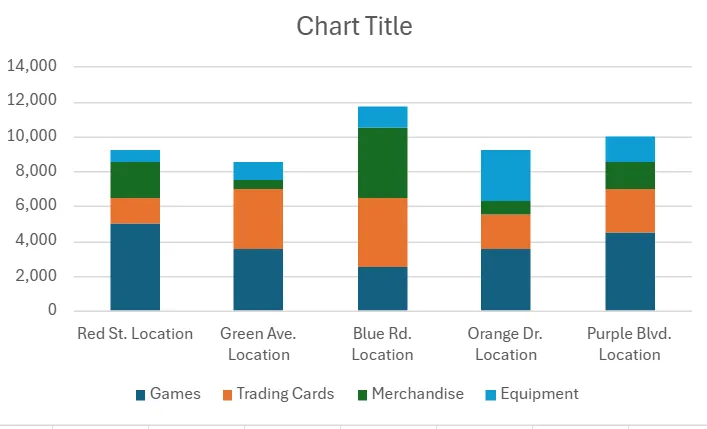
We have prepared a straightforward walkthrough to guide you through the process. In this example, we’re going to use this bar chart to compare the sales of multiple video game store locations and break down how much of each type of product they sell every month.
1. First, make sure to prepare your dataset. Ensure you organise your data so that each column represents a different category. In this example, we have the first column be the store location itself, and then the four columns of data that we want included in the chart, which are the different product categories that each store sells. Also, make sure you have the data inside each cell in every column, as well.
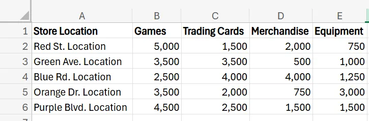
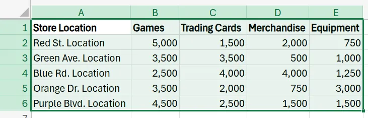
2. Once you have the proper data, select it by dragging your mouse over the cells that contain the data.
3. With your dataset selected, go to Insert in the Excel ribbon, navigate to the chart section, find Stacked Column, and click it.
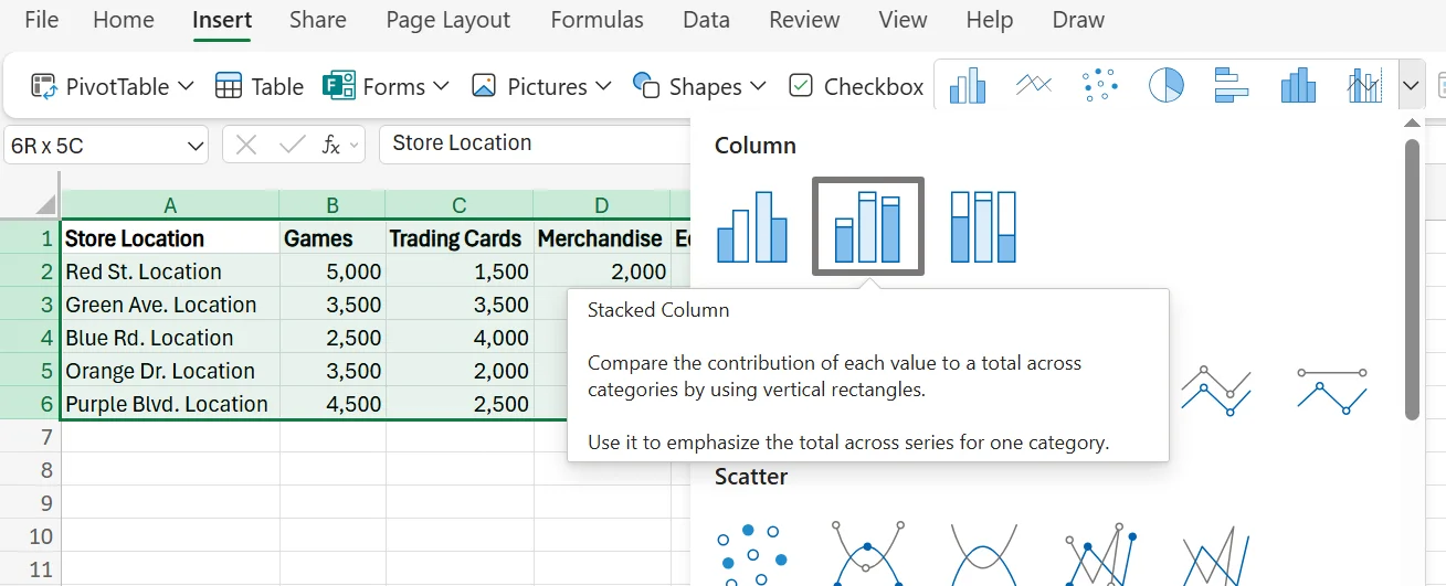
4. After you click, a stacked bar chart will automatically be generated and added to your Excel workbook.
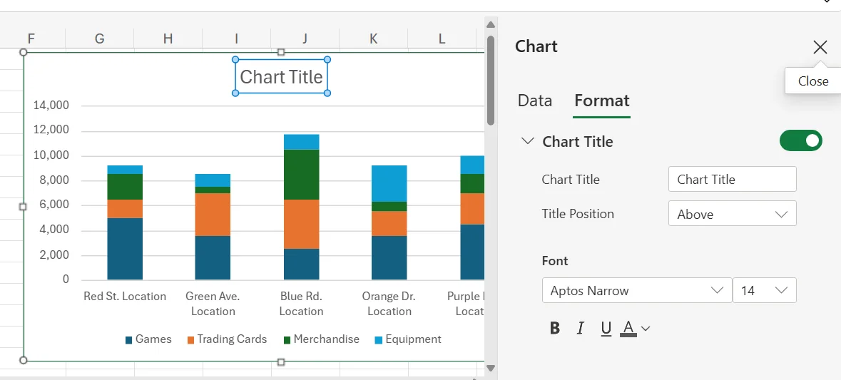
5. Next, you can customise your chart to your liking. We recommend starting by changing the title. To change the title, simply double-click on the title, and in the menu that pops up, simply adjust the title to whatever you want. You can also switch up the location of the title or the font, as well.
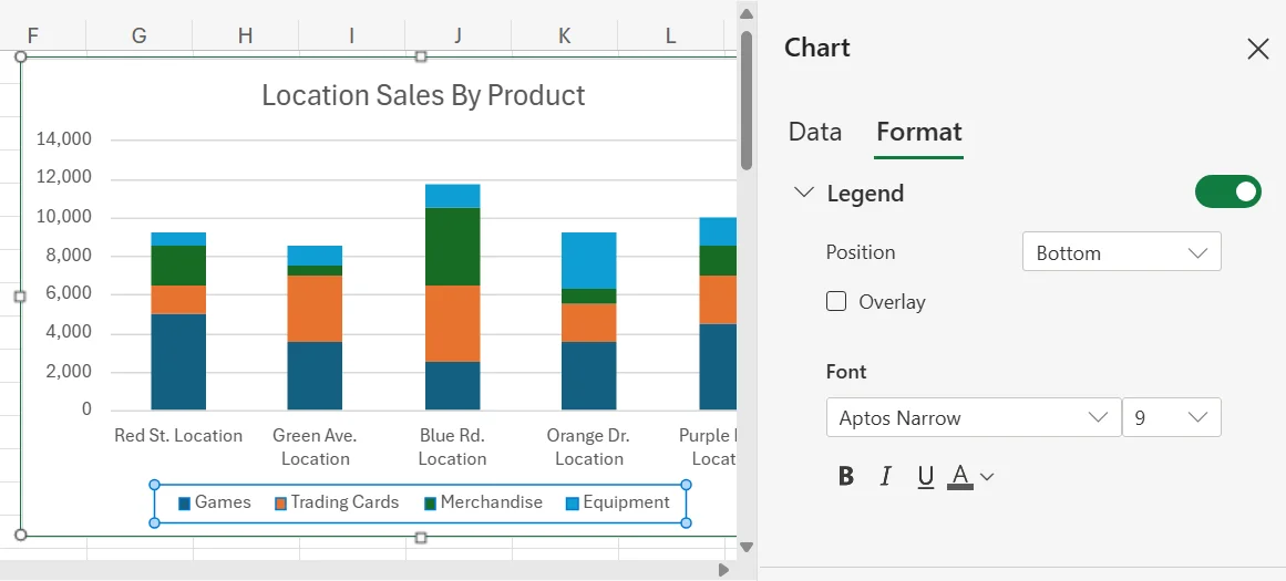
6. If your legend is incorrect or located in the wrong place, you can also make adjustments to it by double-clicking your legend and then making the changes in the pop-up menu that appears.
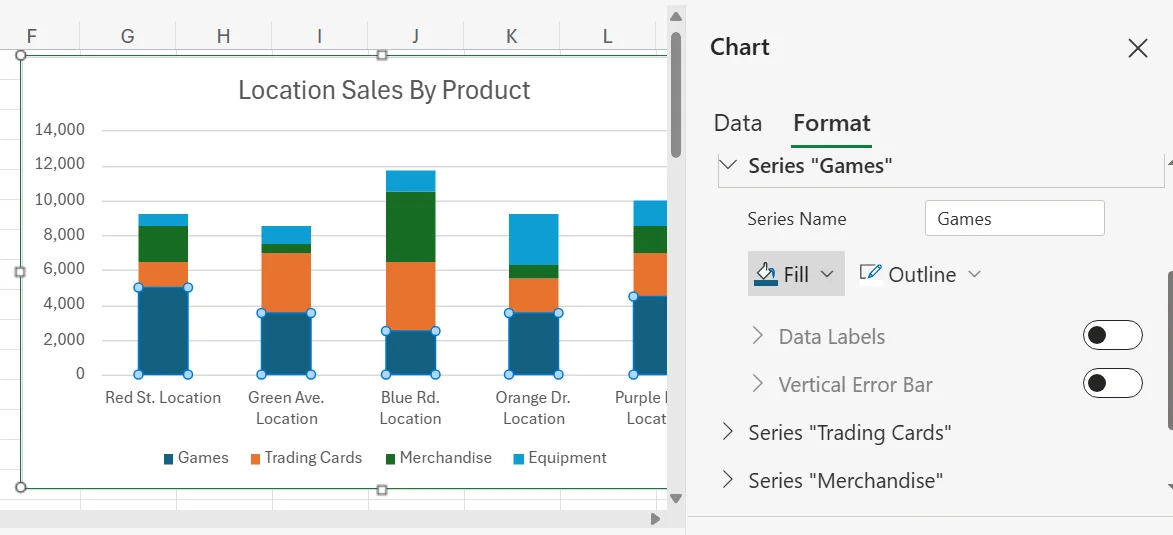
7. If you want to adjust the colours of any of the sub-bars, it’s as easy as double-clicking one, choosing the proper category from the list of Series in the popup menu, and selecting a different colour using Fill.
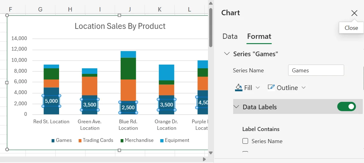
8. If you want to add the numbers into the sub-bars in the chart for more clarity, simply click on a sub-bar and turn Data Labels on. However, keep in mind that this may look a little strange if you have some sub-bars that are very thin, as there may not be enough space for the numbers to fit nicely.
Tips and Best Practices for Stacked Bar Charts
Here are a few best practices and tips for using stacked bar charts.
Limit the Number of Stacks
To help boost the clarity of your chart, do your best to limit the number of stacks in each bar. You should try to keep it to around four or fewer stacks per bar. If you try to have 10 stacks per bar, the chart may be too confusing, crowded, and overwhelming to analyse properly.
Label Each Stack Clearly
For each axis and bar, make sure to add a clear and concise label, so viewers know what everything is and can make sense of the data. Many stacked bar charts feature a lot of different colours and sections, and not clearly labelling them can lead to a ton of confusion. Also, avoid making the labels too long, as this could add unnecessary clutter and distraction to the chart.
Use Colours Well
Another tip is to ensure you’re using colours well. Use different colours for different categories, and make sure to go with colours that are easy to distinguish from one another. If you use too many similar colours within the chart, it may make it harder to tell the two apart, and this could lead to improper data analysis or reporting.
Do you want to boost your team’s digital skills and grow your business?
Related Articles
 Tips & Tricks
How to Create a Histogram in Excel
This article provides a step-by-step guide on how to create a histogram in Excel to visualise numerical data distributions. It walks readers through importing data, inserting a histogram, customising the chart, adjusting bin widths, and adding data labels. The guide uses employee age data as an example and highlights how histograms can help identify patterns and outliers.
 Tips & Tricks
Can you Calculate Variance Using Excel?
In this guide, we explain variance as a measure of how widely data points deviate from the mean and shows why understanding this spread is useful for deeper insight and risk assessment. It walks readers through calculating variance in Excel, distinguishing between the VAR.S function for a sample and VAR.P for an entire population, then demonstrates each with a car-sales case study.
 Tips & Tricks
How to Use Excel Lookup with Multiple Criteria
This blog explains how Excel’s LOOKUP functions—particularly XLOOKUP and VLOOKUP—can retrieve data based on multiple criteria. It walks through a step-by-step example of finding an employee’s sales in a specific region, showing both an XLOOKUP formula and a VLOOKUP alternative that uses a helper column.