- TIPS & TRICKS/
- Leveraging Excel Percentage Change Analysis for Strategic Business Insights/


Leveraging Excel Percentage Change Analysis for Strategic Business Insights
- TIPS & TRICKS/
- Leveraging Excel Percentage Change Analysis for Strategic Business Insights/
Leveraging Excel Percentage Change Analysis for Strategic Business Insights
Excel’s percentage change formula, =(New Value – Old Value)/Old Value, goes beyond basic arithmetic. It equips you with a lens to view your numbers in a fresh light; it turns raw data into something meaningful. Perhaps you’ve already dipped into our first article on percentage change and grasped the essentials.
Here, we’ll unpack how to use this formula as a proper strategic tool; you’ll learn to tease out financial trends and steer your efforts with confidence. Let’s dive in!
Our instructor-led training courses in Excel are suited for both beginners and advanced users. Check them out!
Advanced Financial KPI Development
Percentage change isn’t a one-trick pony; it’s the heart of key performance indicators (KPIs) that keep tabs on how your business is doing. Here’s how to make it work harder.
Crafting KPIs with % Change
Take your revenue. Last year, you pulled in £100,000; this year, it’s £115,000. Pop =(115000-100000)/100000 into Excel, and you’ve got a 15% jump. That’s your growth KPI; something to check every few months or yearly. Try it on costs (£50,000 last time, now £52,500 = 5% up) or team output (200 jobs done, now 220 = 10% more) to see the whole picture. This isn’t just number-crunching; it’s about spotting what’s doing well or lagging.
Spotting Trends Over Time
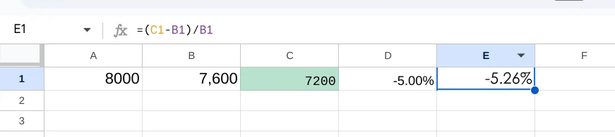
Don’t just compare two moments. List monthly takings; £10,000, £10,500, £11,000—in cells A1 to C1. Type =(B1-A1)/A1, then =(C1-B1)/B1, and you’ll see a neat 5% rise each step. Grab Excel’s fill handle, drag it along, and watch years of trends unfold; showing if you’re picking up speed or hitting a wall. A small shop could use this to see if sales dip after summer (£8,000, £7,600, £7,200 = -5%, -5%), hinting at seasonal tweaks. Or, a council might track bin collections (500 tonnes to 525 = 5% up) to plan lorry routes.
Add a column for notes; weather, campaigns, anything—and you’ve got context to back your instinct. It’s simple but sharpens your focus on what’s moving the needle, whether you’re chasing profit or public good.
These examples turn your figures into KPIs you can act on, shedding light on income, spending, and growth, whatever your line of work. Now let’s look at how you can integrate Excel with BI tools.
Integrating Excel with Business Intelligence Tools
Excel is a powerful tool on its own, but when combined with platforms like Power BI, it becomes part of a robust system for generating real-time insights. Here's how to get started.
Linking Excel to Power BI Dashboards
Take that 15% revenue rise and send it to Power BI. Use “Get Data” to whip up dashboards that update as your KPIs shift. A shopkeeper might see sales leap after a promo; say, £12,000 to £13,800—pinpointing which flyer or discount did the trick. Or a council could track library visits (1,200 to 1,260 = 5% up), tweaking hours based on what the screen shows, all in real time. It’s not just flashy graphs; it’s your data talking back, loud and clear. Pop your Excel file onto a shared drive, link it up, and watch the numbers dance as they land—no faffing about with manual updates.
Automating the Clever Stuff
Hook Excel to a source like your CRM, then let =(New Value – Old Value)/Old Value crunch the changes. Pipe it into Power BI for charts that move—like costs slipping from £5,000 to £4,800 (-4%)—so you can focus on the big calls, not the grunt work. Set up a live feed from sales logs or service tickets, and Excel churns out % shifts (300 calls to 330 = 10%) without you lifting a finger. A non-profit might watch donor clicks rise (50 to 60 = 20%) and tweak their next email blast on the fly. It’s about cutting the busywork—letting the tools sweat so you can strategise.
This combo makes tricky analysis a doddle, speeding up decisions with pictures that click for everyone.
Decision-Making & Training Insights
This isn’t just about sums; it’s a tool for steering the ship:
Planning and Predicting
A 5% rise in visitors (1,000 to 1,050) might push a council to grow services, while a 10% cost creep screams for savings. Excel’s formula keeps you on track, rooting your guesses in facts. Picture a small business tracking ad spend; £2,000 to £2,200 (10% up)—and sales ticking from £10,000 to £11,500 (15%). That =(11500-10000)/10000 shows the campaign’s worth it, nudging them to double down next quarter. Or a charity spots event turnout dip (200 to 180 = -10%) and pivots to virtual gigs. It’s not crystal-ball stuff—just solid numbers guiding your next step, whatever your game.
Boosting Your Team
Bespoke courses; capped at six—get your staff wielding these tricks. Tiny groups mean loads of chat, proper grasp, and skills that last, turning rookies into planners. Imagine your crew huddled round, puzzling out why costs jumped 8% (£5,000 to £5,400). With a trainer who’s all ears, they dig into the whys; new suppliers? Price hikes?—and leave knowing how to tackle it. Future Savvy’s small setup lets them ask daft questions and get sharp answers, building confidence to spot trends or flag risks on their own.
Nailing this lifts your crew’s knack for sniffing out wins and dodging pitfalls, all thanks to Excel’s flexibility.
Knowing how to calculate % change in Excel isn’t just a techy win; it’s your ticket to business smarts. From shaping KPIs to syncing with Power BI, it hands small firms, charities, and government squads the tools for sharp, bold choices.
Ready to see your data reveal its secrets? Let’s explore this together, and put it to work. Contact us today!
Related Articles
 Tips & Tricks
How to Calculate % Change in Excel
The guide explains that percentage change in Excel is calculated with the simple formula
=(New Value – Old Value)/Old Value. It walks readers through entering data, applying the formula, formatting results as percentages, and using the fill handle to extend calculations across multiple rows. Finally, real-world examples—from revenue tracking to budgeting—show how this metric supports decisions, and a Q&A section answers common Excel questions. Tips & Tricks
Enhancing Corporate Reporting with Excel's AGGREGATE Function
In this guide, we look at how Excel’s AGGREGATE function turns messy, multi-source data into reliable, actionable reports by performing sums, counts, averages, percentiles, and other calculations while automatically ignoring specified errors or hidden rows. Best practices include labelling outputs clearly, testing formulas on small samples, combining AGGREGATE with pivot tables or filters, and using Excel’s error-checking tools to troubleshoot formulas for maximum accuracy and efficiency.
 Tips & Tricks
Comprehensive Guide on the Formula for VAT in Excel
The article explains how businesses can quickly calculate value-added tax in Microsoft Excel using the formula
=Net*(1+VAT), where the VAT rate is set with an absolute cell reference for accuracy. It walks through setting up columns for net sales, VAT rate, and gross sales; entering the formula; copying it down multiple rows; and double-checking results. Automating VAT this way streamlines invoicing, enhances financial reporting, and minimizes manual errors.