- TIPS & TRICKS/
- How to Create a Radar Chart in Excel/


How to Create a Radar Chart in Excel
- TIPS & TRICKS/
- How to Create a Radar Chart in Excel/
How to Create a Radar Chart in Excel
If you have a complex dataset with multiple variables and want to compare the data for each variable to one another in Excel, a radar chart is a great option to consider. It lets you visualise several variables in a single chart, in a way that nearly anyone can follow and understand in seconds.
This guide goes over what a radar chart in Excel is, the benefits they offer companies, the business applications they have, and how you can create your own in a few easy steps.
If you and your team are interested in levelling up your digital literacy, make sure to check our other instructor-led Excel training courses!
Download our Excel Formulas Cheat Sheet
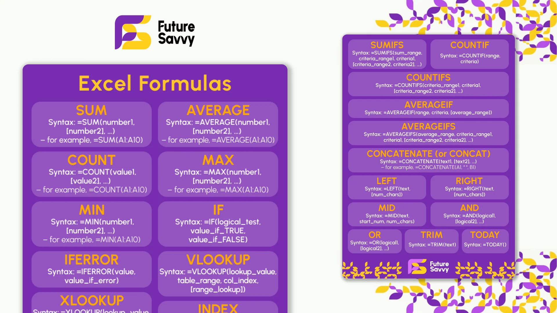 Download now
What Is a Radar Excel Chart?
A radar chart in Excel is a type of data visualisation tool that displays multiple variables on different radial axes that all start from the middle of the chart and then extend outward. The length and size of each axis depend on how large or small its variable is.
It’s a great way to not only show off multiple data points, but also directly compare them to one another and see how they differ. The axis for each variable is also connected with a line, which builds a polygon.
This visualisation tool is called a radar chart because the polygon on the chart often resembles the display screen of an air traffic control radar or weather radar as they scan.
Key Benefits and Applications of Radar Excel Charts
Radar charts offer several benefits, such as quickly revealing patterns, outliers, and commonalities, using space efficiently, and being easy to follow and understand. These charts also provide a full and comprehensive overview of how different entities compare to each other, and present a lot of data in a way that isn’t overwhelming. They’re also visually appealing, which is great for making data more engaging.
They also have numerous potential business applications, such as:
- Identifying the strengths and weaknesses of employees
- Comparing products, materials, suppliers, and a variety of other things
- Tracking the success of marketing campaigns
- Identifying patterns or outliers
- Evaluating different job candidates
- Monitoring company budget vs. spending
How to Create a Radar Excel Chart in Excel
Now that you know what radar charts are and the benefits and applications they have, let’s go through the steps of creating your own in Excel.
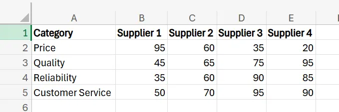
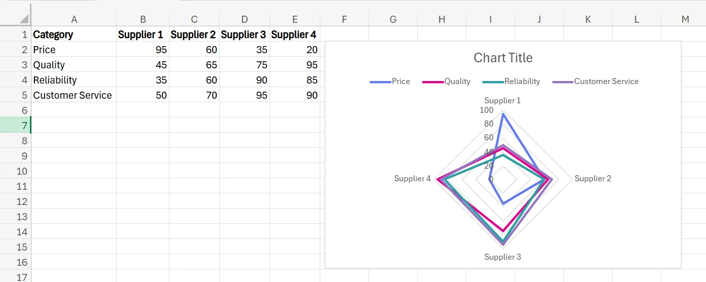
While there are many ways to use a radar chart, this example focuses on a company that’s using one to compare suppliers from 0 to 100 in different categories to help decide which is the best choice for the business. A 100 represents the best possible score, while a 0 represents the worst.
1. Open up your dataset and prepare the data. For this example, this means including the different variables/categories for each supplier, and the score you’d give them for each one.
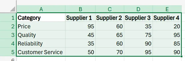
2. Once the dataset is complete, drag your mouse over the entire dataset to select it.
3. Next, go to the Excel ribbon and select Insert, and then find and click Radar.
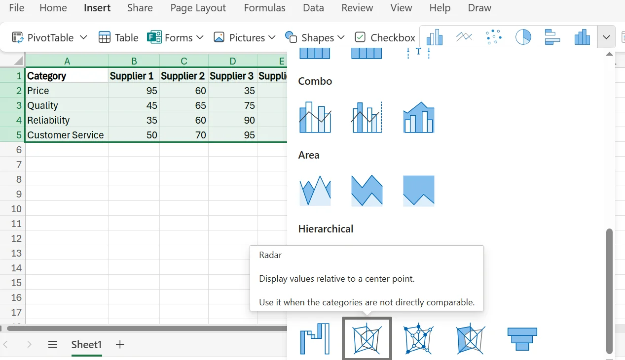
4. As soon as you click Radar, Excel automatically creates a radar chart for you.
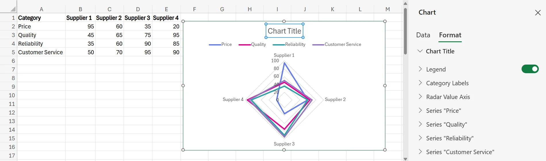
5. To customise and fine-tune the radar chart, simply double-click anywhere on the chart. You can change and adjust the title, the labels, the colours, and more, to ensure it looks the exact way you want.
Best Practices and Tips for Using Radar Excel Charts
To ensure you get the most out of your radar Excel chart, here are a few tips and best practices to keep in mind.
Limit Categories if Possible
While you need at least three variables/categories in your radar chart, you should be careful not to have too many. If you try to create a radar chart with too many variables, the chart will be incredibly cluttered and confusing to look at, as having too much going on makes it hard to follow. Try to limit your radar charts to 5 to 8 variables at most.
Clearly Label Every Part of the Chart
To make your radar chart as easy to follow as possible, you should make sure to label every part of it. This includes adding a title and ensuring each axis is described properly. Each label should be short, concise, and instantly tell the viewer what they’re looking at, to reduce the potential for confusion. While any labels are helpful, consider making them bold or adding colour to draw people’s attention.
Use Consistent Scaling
To keep the chart looking good and ensure it’s not unnecessarily confusing, use consistent scaling from one axis and variable to the next. If your scale is inconsistent and varies throughout the chart, it’ll lead to issues like visual distortion and inaccurate comparison between data.
It may also lead to people making incorrect interpretations of the data. Using a fixed data range ensures that all of your data points are consistent and can be compared to one another successfully.
Get in touch today to find out how we can help take your business to the next level!
Related Articles
 Tips & Tricks
How to Create a Stacked Bar Chart in Excel
A stacked bar chart lets you see both totals and the category-level breakdown within each bar, making comparisons richer than a standard bar chart. The article walks you through creating one in Excel: organise data by categories, select the range, choose Insert › Stacked Column, and fine-tune titles, legends, colours, and data labels. Best practices include limiting each bar to roughly four stacks, adding concise labels, and using clearly distinguishable colours to keep the visualisation readable. W
 Tips & Tricks
How to Create a Histogram in Excel
This article provides a step-by-step guide on how to create a histogram in Excel to visualise numerical data distributions. It walks readers through importing data, inserting a histogram, customising the chart, adjusting bin widths, and adding data labels. The guide uses employee age data as an example and highlights how histograms can help identify patterns and outliers.
 Tips & Tricks
How to Create a Spider Chart in Excel
Spider (radar) charts plot several variables on axes radiating from a central point and connect them into a polygon, making complex multivariate data easy to see at a glance. They help compare strengths, weaknesses, patterns and outliers. In Excel you simply lay out the data, choose Insert → Radar, then tweak titles, labels, colours and axes to suit.